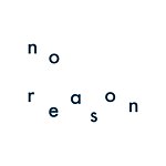
The inspiration comes from a passage in Haruki Murakami's novel "First Person Singular," a work I've long admired. In the short story, "<Butter>", there's a quote:
"You know," the old man said, as if he were about to spit out something hard, "hardly anything worthwhile in this world can be obtained without effort." Then, as if starting a new paragraph, he coughed concisely. "But once you've spent time and energy accomplishing that difficult thing, it becomes the butter of your life."
"Butter?"
"Do you know the expression 'crème de la crème' in French?"
I said I didn't. I knew nothing about French.
"It means the cream of the cream, the very best. The most important essence of life – that's 'crème de la crème.' Do you understand? Everything else is just bland and uninteresting."
https://live.staticflickr.com/65535/53224173264_071b5e65ca_c.jpg
-
As I've created planners year after year, my hope is always to offer something new, practical, and beautiful each time it's seen.
I strive for innovation without being overly ostentatious, while also considering what others might appreciate.
This challenge has only grown with each iteration.
The cost for this year's creation has also reached a new height.
The cover uses thick gray cardstock, with three plates for letterpress printing.
Three colors, more vibrant than ever, are used: sapphire blue, forest green, and bright orange.
https://live.staticflickr.com/65535/53224173504_d897ff80d0_c.jpg
https://live.staticflickr.com/65535/53224173614_0aa10a78ee_c.jpg
https://live.staticflickr.com/65535/53224173579_b2c7ffd7dc_c.jpg
Therefore, the production process isn't a single print run.
The slight indentation and shadow on the thick cardstock from the lettering are, to me, quite beautiful.
Naturally, I also discussed with the craftsman to achieve the perfect level of indentation.
This time, four beautiful rounded corners have been applied, offering a sense of visual relief.
https://live.staticflickr.com/65535/53229738122_b9bdc69274_c.jpg
What I'm most proud of are the thick endpapers for the front and back covers.
I selected a beautiful shade of blue that almost perfectly matches the title font.
https://live.staticflickr.com/65535/53224173199_60d1b7cfb6_c.jpg
The inner pages are still made with Midori paper.
Printing alternates between blue and green, with lower saturation than the cover.
This is to avoid any visual conflict or discomfort when writing with black or blue pens.
The page order is as follows:
https://live.staticflickr.com/65535/53224101318_1873ef06d6_c.jpg
https://live.staticflickr.com/65535/53223785361_cd739317bb_c.jpg
https://live.staticflickr.com/65535/53222916442_58cbee2409_c.jpg
Each month begins with a checklist for to-dos, making it convenient for planning.
There's also a full page of grid paper for doodling or jotting down inspirations.
https://live.staticflickr.com/65535/53224173764_ce2d91d21d_c.jpg
https://live.staticflickr.com/65535/53222916632_48b5c285c0_c.jpg
Thank you for your feedback.
This year, the weekly planner is placed after each monthly section, allowing for a seamless transition after completing the monthly plan.
Generous writing space is provided for detailed entries.
https://live.staticflickr.com/65535/53224101258_89cdaed40e_c.jpg
https://live.staticflickr.com/65535/53224101243_9b8220ba14_c.jpg
https://live.staticflickr.com/65535/53224291940_209259640f_c.jpg
https://live.staticflickr.com/65535/53222916597_37d6ce6e8e_c.jpg
The binding is an exposed spine stitch, allowing it to lay flat at 180 degrees.
https://live.staticflickr.com/65535/53224100888_c64c79ee68_c.jpg
Although I've used blue binding thread before, this shade was specifically chosen this time.
(I worried it might not be apparent.)
While it's a small detail, it's very important to me.
I hope everyone has a fulfilling and growing 2024.
-
The planner will be sold as a set with the edge-bound cloth calendar; individual items will not be separated.
The cloth calendar comes in four colors:
Deep green
https://live.staticflickr.com/65535/53223783241_eed6b39d2f_c.jpg
Grayish blue
https://live.staticflickr.com/65535/53223783246_e03c9c7b0e_c.jpg
Dark orange
https://live.staticflickr.com/65535/53224099088_586faaf0ed_c.jpg
Grayish green
https://live.staticflickr.com/65535/53223783236_a632ed3762_c.jpg
The fabric is a lightweight nylon, and can be easily attached using washi tape at the four corners.
There are many combinations available in the selection menu.
Detailed introductions for each item can be found here.
crème de la crème Lightweight Shopping Bag
https://www.pinkoi.com/product/7b5ahs5w
crème de la crème Custom Dark Blue Coffee Cup
https://www.pinkoi.com/product/2R97R7gn
รายละเอียดสินค้า
ข้อมูลสินค้า
- วัสดุสินค้า
- กระดาษ
- แหล่งผลิตสินค้า
- ไต้หวัน
- อันดับสินค้า
- No.824 - เครื่องเขียน | No.108 - สมุดบันทึก/สมุดปฏิทิน
- ความนิยม
-
- ถูกชม 23,993 ครั้ง
- จำหน่ายไปแล้ว 123 ชิ้น
- มี 480 คนถูกใจ
- สินค้าที่จำหน่าย
- สินค้าต้นฉบับ
- รายละเอียดย่อยของสินค้า
- The cover features letterpress printing in three more vibrant colors than before: sapphire blue, forest green, and bright orange. Four beautiful rounded corners have been added. The inner pages are still made with Midori paper. Printing alternates between blue and green. The binding is an exposed spine stitch, allowing it to lay flat at 180 degrees. The size is A5, with a thickness of approximately 1.5cm.
ค่าจัดส่งและรายละเอียดอื่นๆ
- ค่าจัดส่ง
- วิธีชำระเงิน
-
- บัตรเครดิต/เดบิด
- อินเตอร์เน็ตแบงก์กิ้ง/โมบายแบงค์กิ้ง
- เคาน์เตอร์เซอร์วิส
- ตู้เอทีเอ็ม
- เคาน์เตอร์ธนาคาร
- Alipay
- การคืนเงินและเปลี่ยนสินค้า
- อ่านรายละเอียดการคืนเงินและเปลี่ยนสินค้า
- แจ้งปัญหา
- รายงานสินค้าชิ้นนี้
- บทความที่เกี่ยวข้อง


